Objective – For this project, I designed TableMates, a mobile app that helps college roommates plan and share casual meals together while staying on budget.
The goal was to create a simple, friendly platform that encourages connection through cooking, without the stress of rigid planning or complicated tools.
Benchmarking
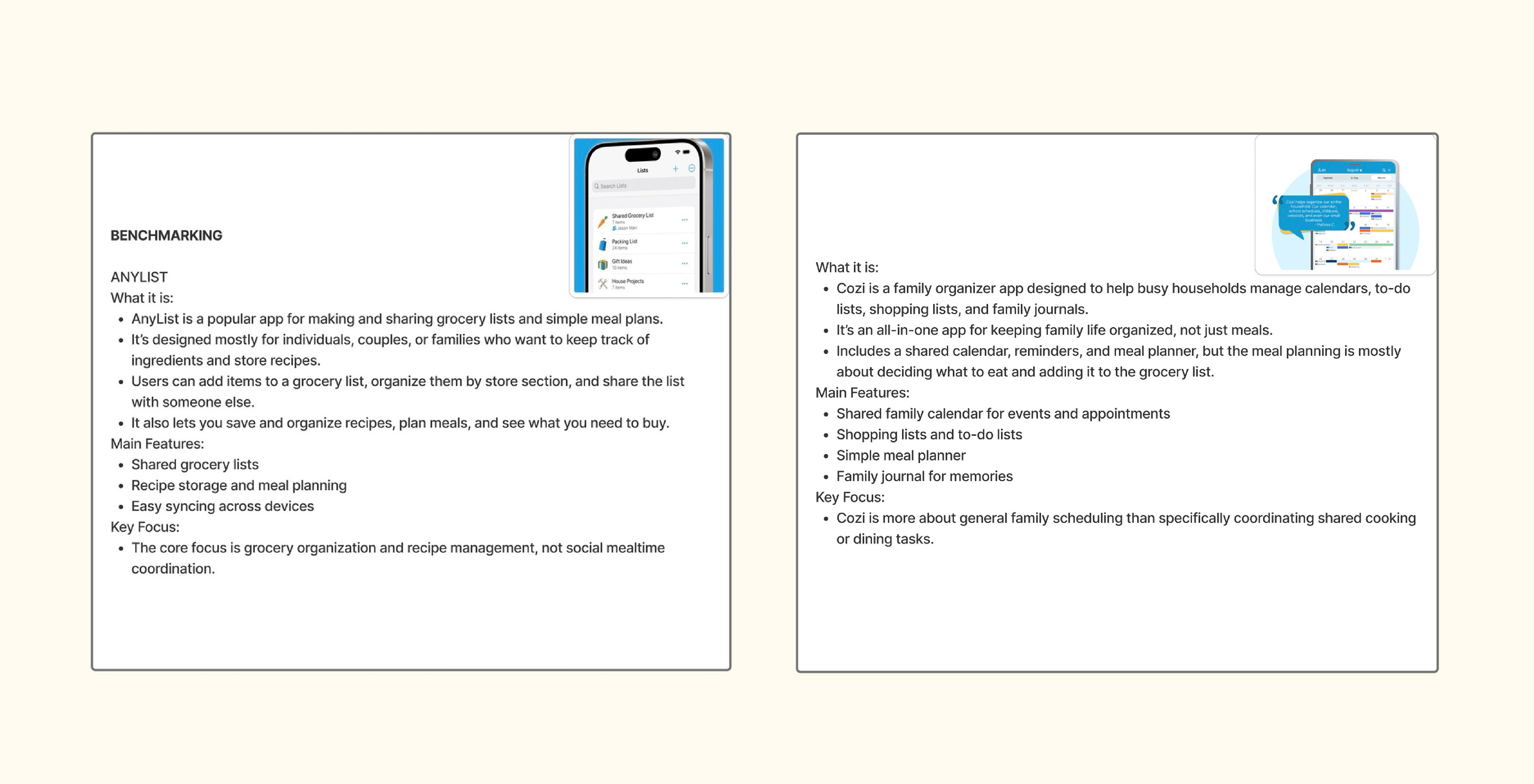
I began by benchmarking Cozi and AnyList, two apps focused on meal planning and grocery organization. Cozi had strong shared calendars, and AnyList was great for food preferences and collaborative lists. However, neither focused on social connection, which I saw as a missed opportunity. I also did informal research on common meal planning pain points. Users wanted flexibility, simplicity, and a way to connect over shared meals, insights that helped shape Tablemates as both a planning and social tool.
Personas
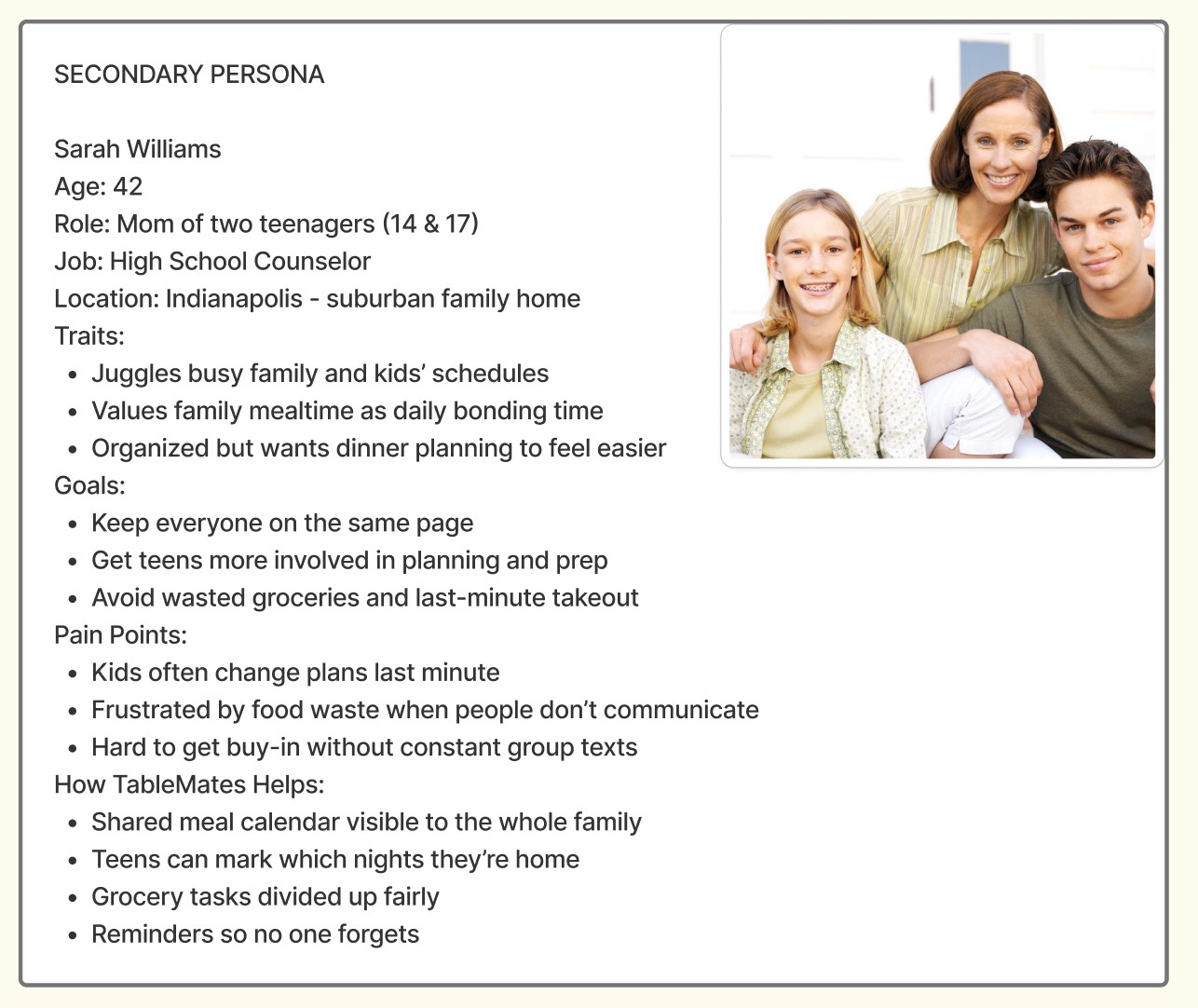
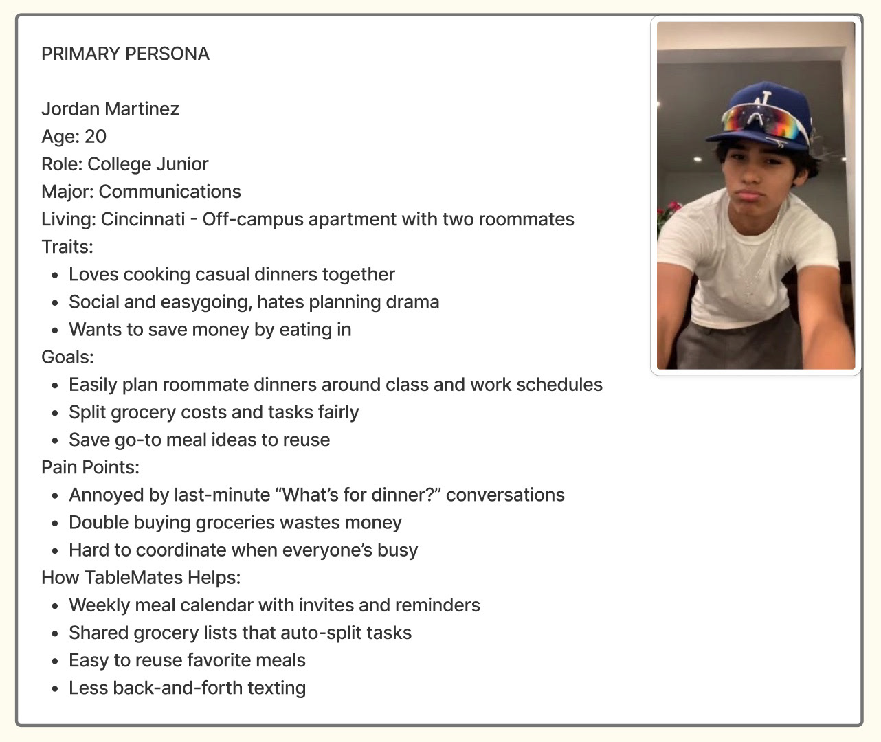
To guide my design, I created two user personas. My primary persona is Jordan, a 20-year-old college student who cooks with roommates and wants to simplify meal planning and grocery coordination. Tablemates helps by offering shared calendars and grocery lists. My secondary persona, Sarah, is a busy mom managing family dinners with teens. The app supports her with reminders, shared tasks, and a family meal calendar. These personas helped me prioritize features for both communal living and busy households.
Task Flow
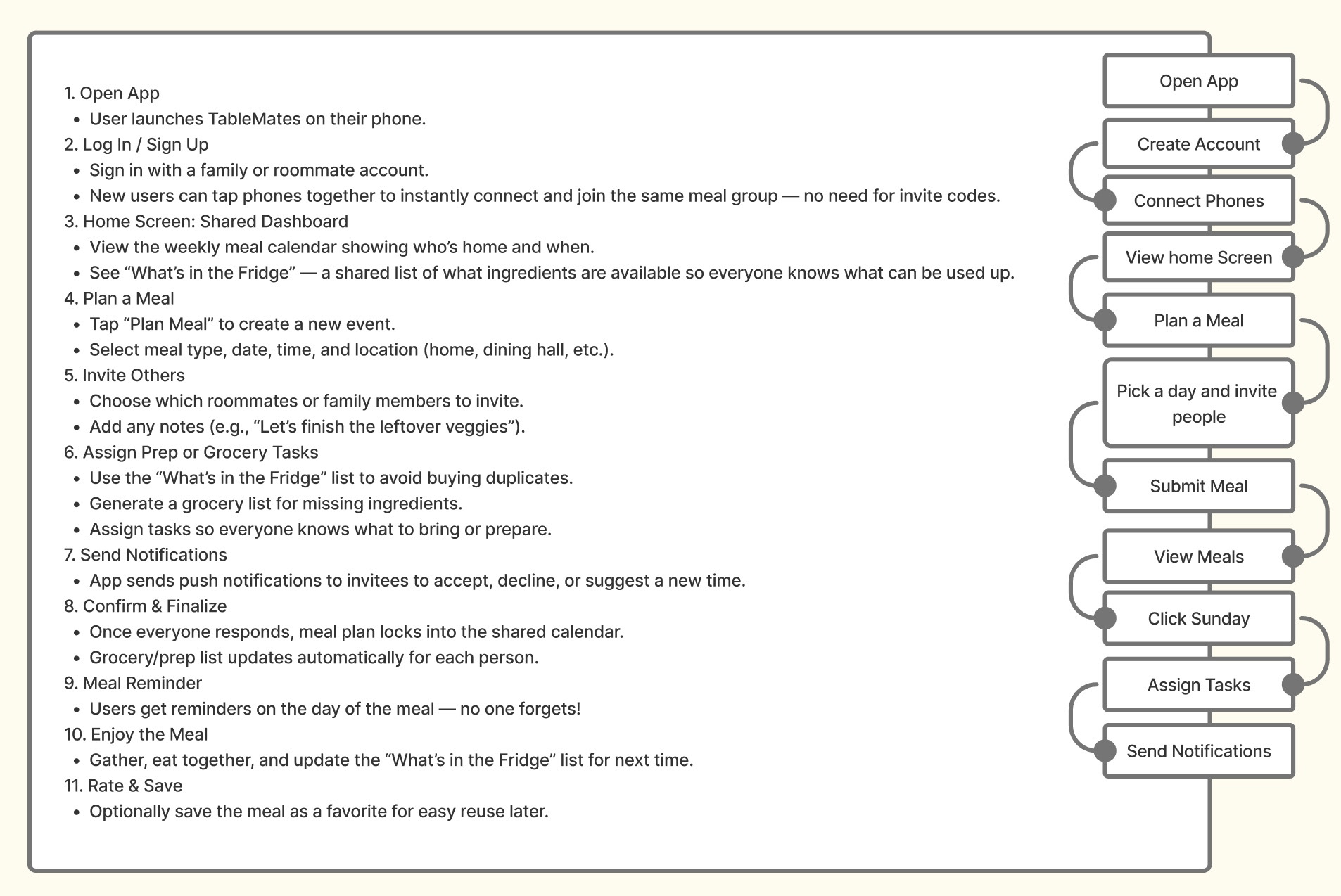
I designed the task flow to be simple and intuitive. After logging in, users land on a clean dashboard with upcoming meals and notes. From there, they can create a meal, check the calendar, or view existing plans. Each step builds on the last, making it easy to plan, share, and stay organized without extra hassle.
Paper Prototypes
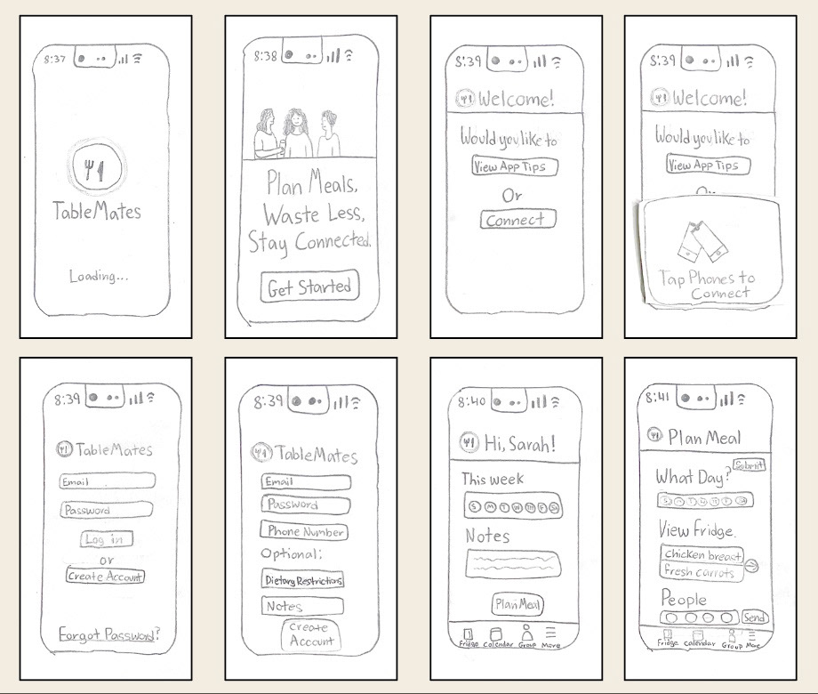
Through the process of creating paper prototypes, I explored the layout and core features of Tablemates. I sketched key screens like login, the dashboard, and meal planning flows to quickly test ideas for layout and navigation. This helped me work through usability and screen hierarchy before moving into digital wireframes.
Digital Wireframes
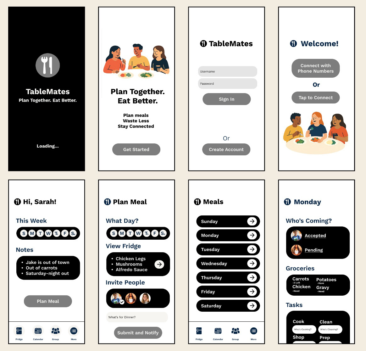
Following the paper prototypes, I moved on to creating digital wireframes to better define the app’s layout and navigation flow. This step allowed me to refine the structure, establish consistent spacing, and focus on usability without getting distracted by visual details. Developing wireframes helped create a clear blueprint for the app, making it easier to communicate design decisions and prepare for the next stages.
Style Guide
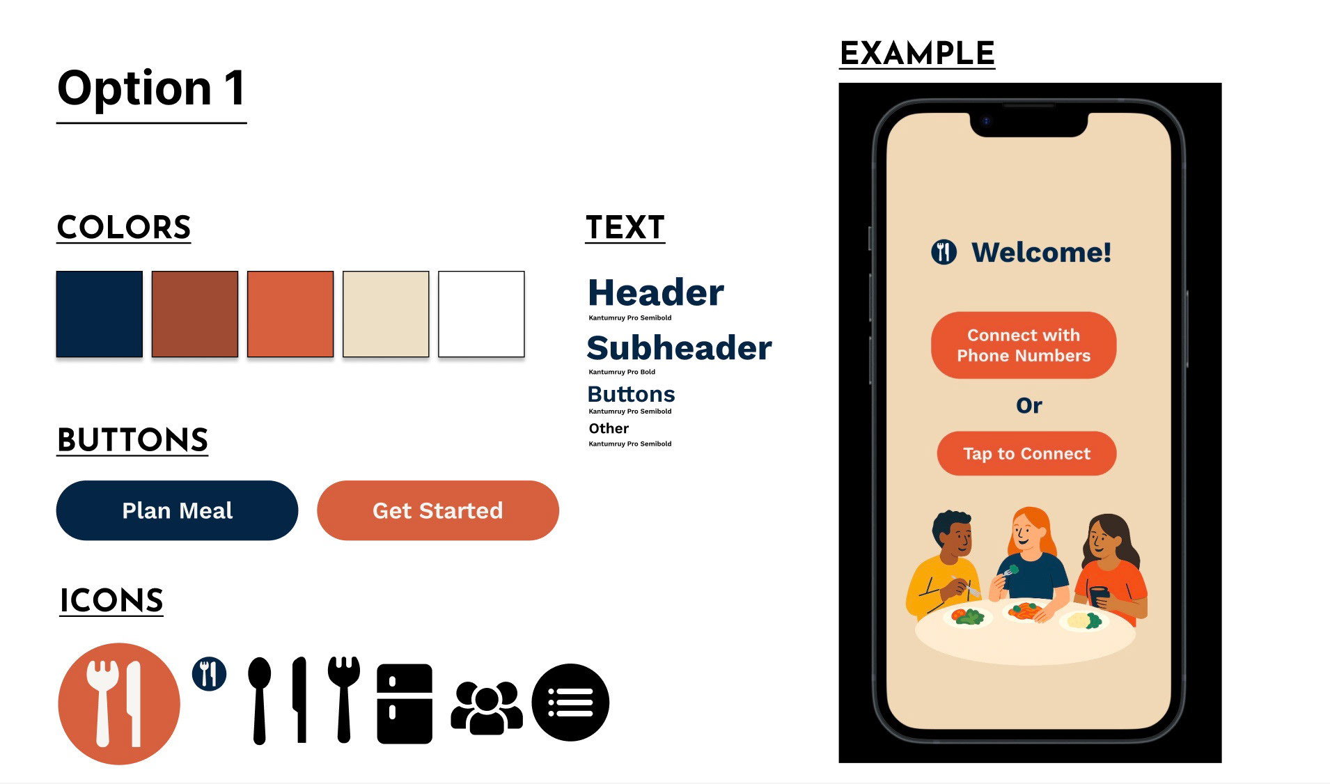
The style tile features a warm color palette, clean sans-serif fonts, and simple icons to create a friendly, approachable feel. The colors support clarity and accessibility, while the typography keeps the interface modern and easy to read. Overall, the style tile sets a tone that’s welcoming without being cluttered, matching the app’s focus on simplicity and collaboration.
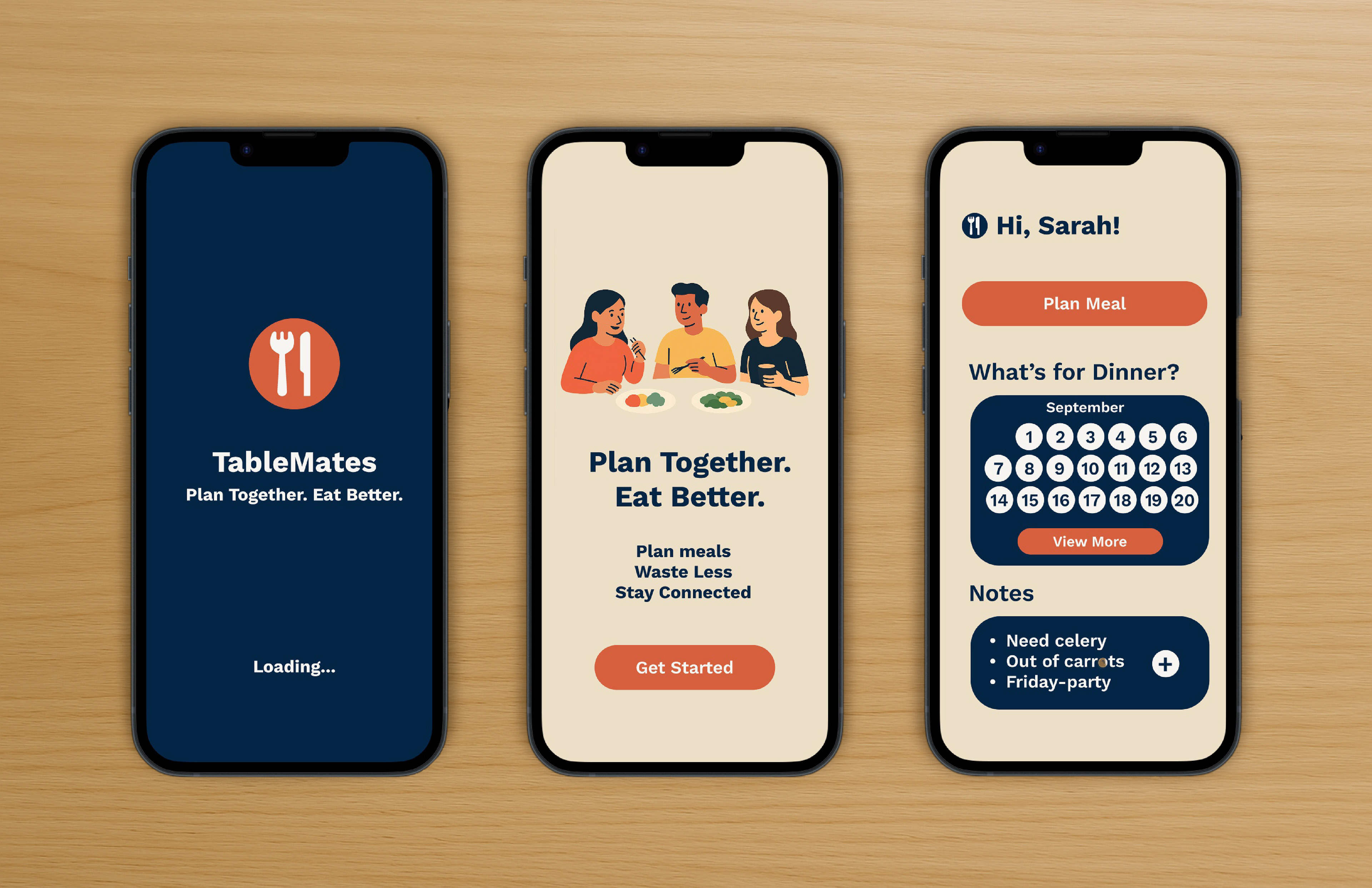
Final Designs
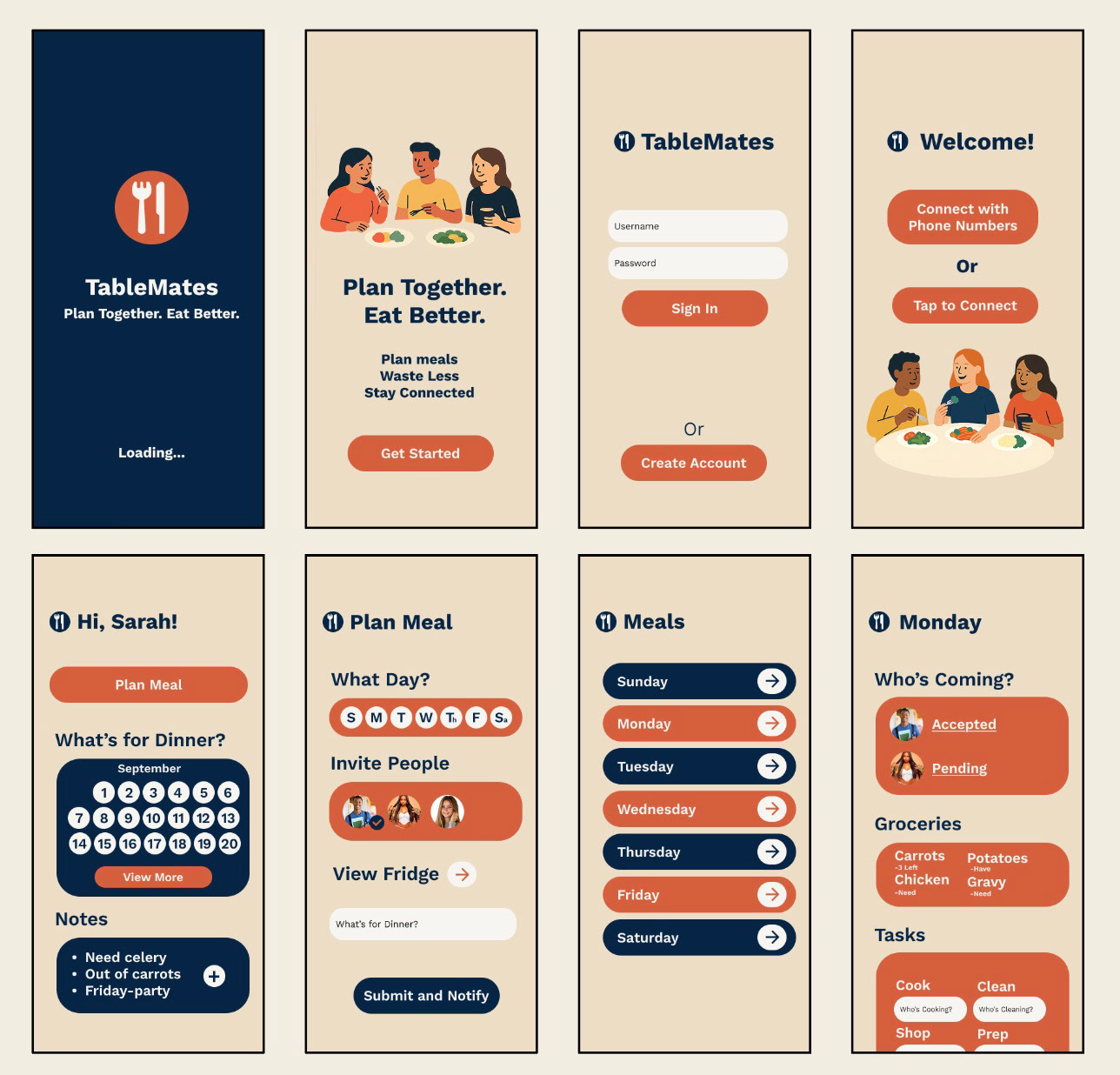
For the final designs, I focused on keeping everything clear and easy to use. I stuck with the layouts and style from earlier stages but polished them to feel friendly and inviting. The goal was to make meal planning simple and stress-free while encouraging people to work together without feeling overwhelmed.
Final Prototype