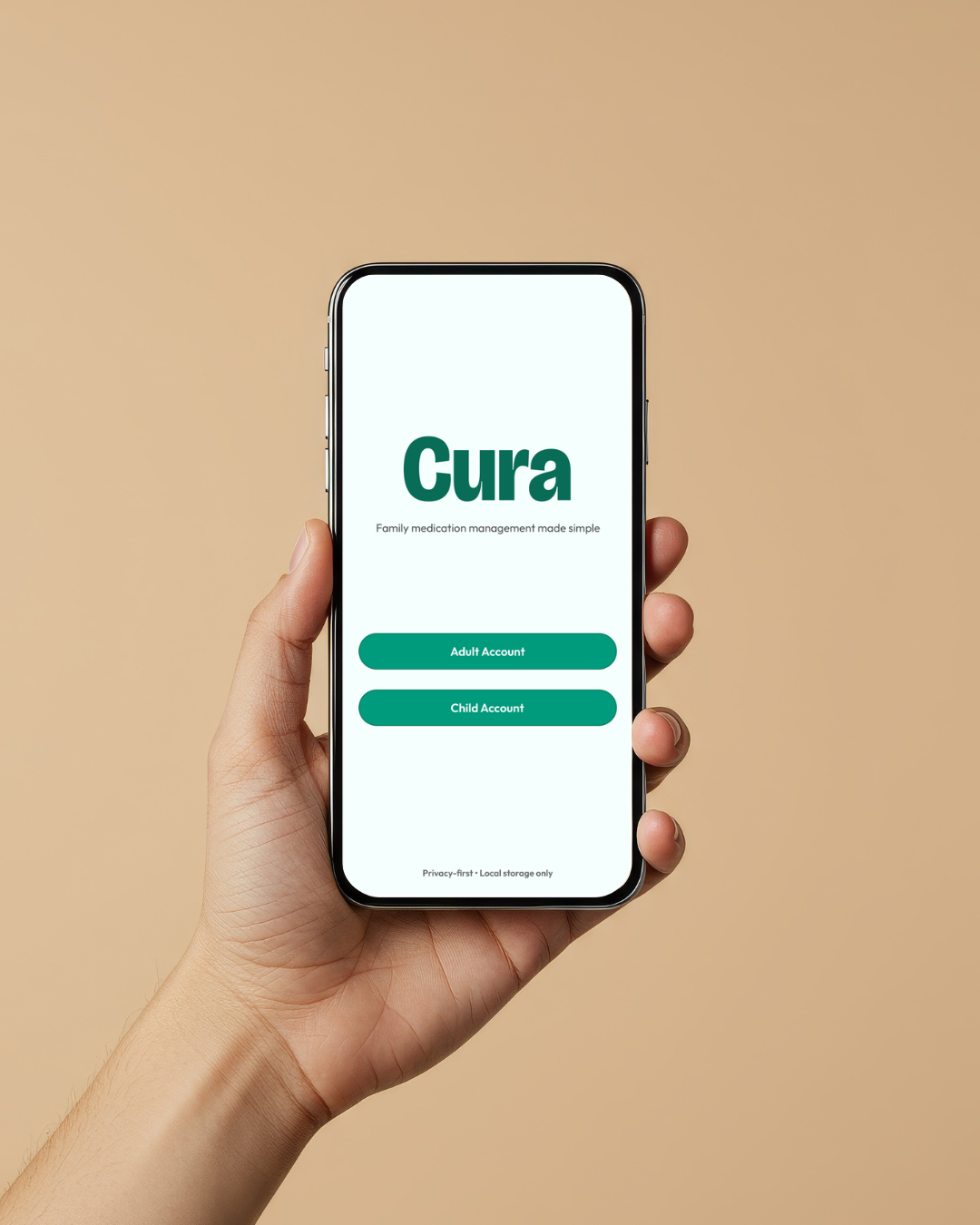
Objective – For this project, I designed Cura, a mobile app that helps parents and caregivers manage and track their children's medications.
The goal was to help families manage and coordinate medication responsibilities and support children as they begin taking more ownership of their routines.
Benchmarking
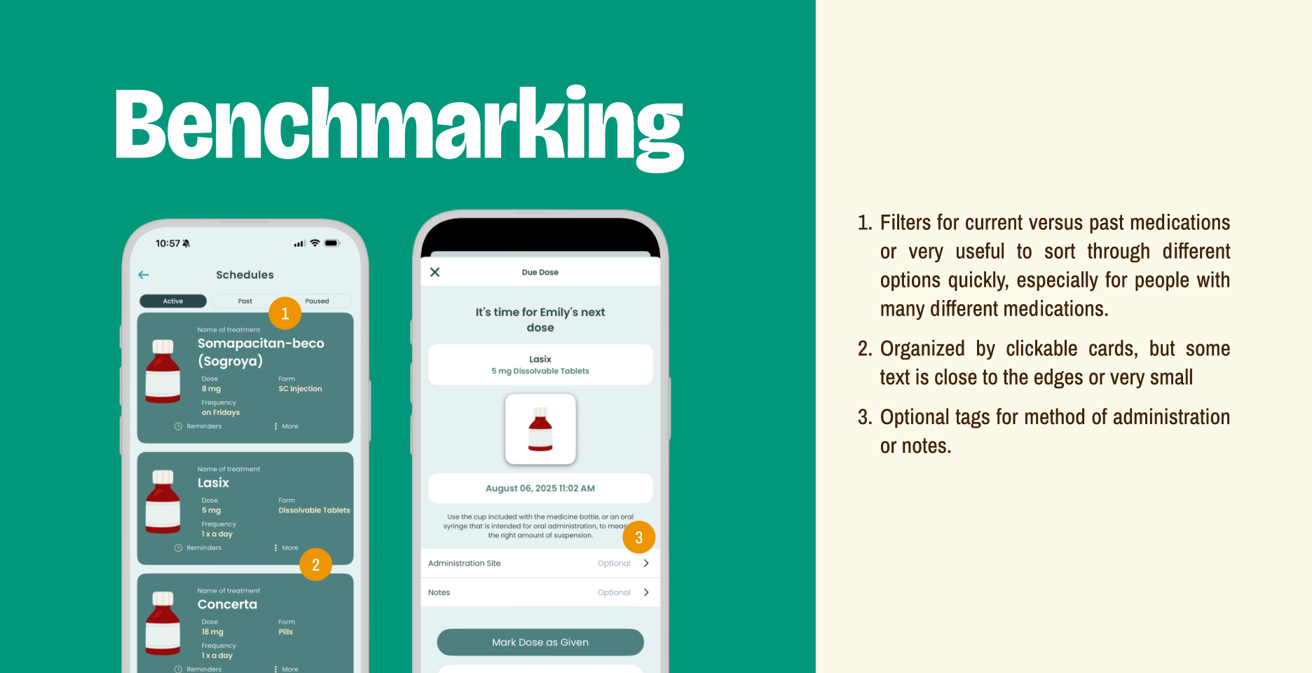
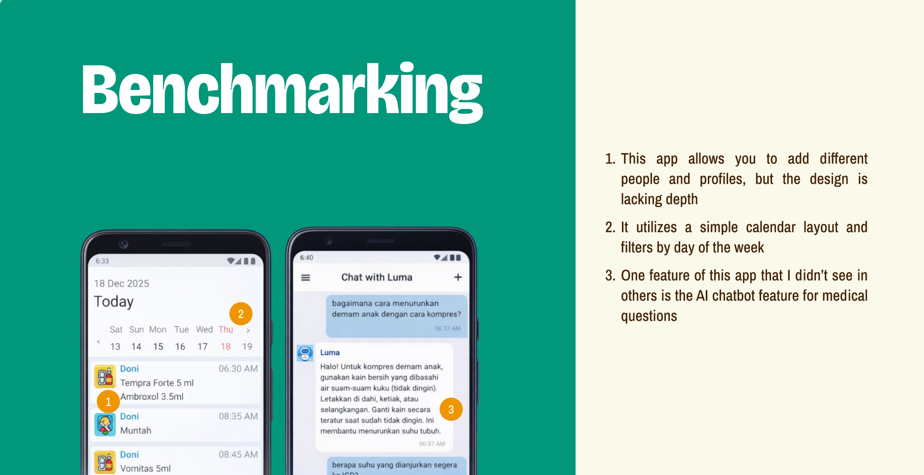
Studying existing medication‑management apps became a critical early step in shaping my design direction. By breaking down how different platforms organize schedules, surface urgency, and handle complex medication data, I was able to identify both strong patterns worth adopting and usability gaps that needed solving.
Personas
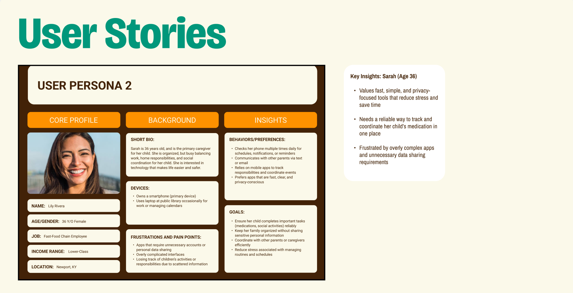
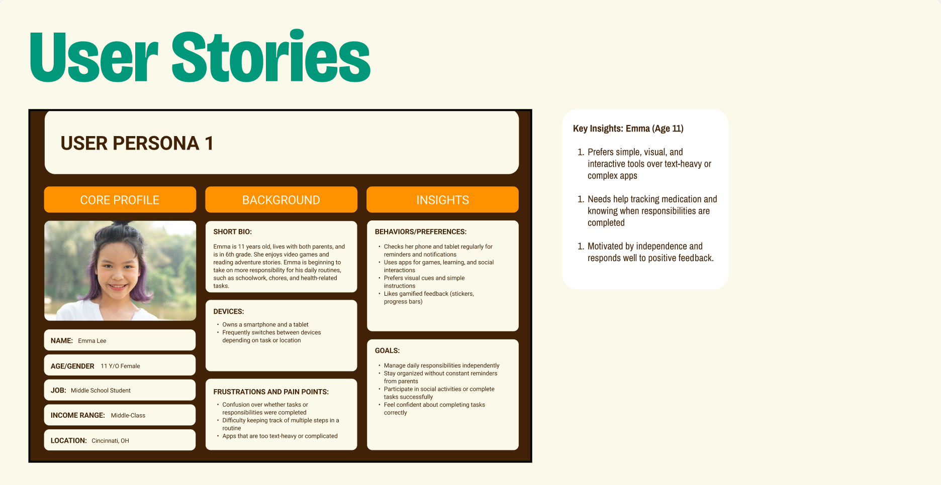
Building my personas helped me understand two different roles in a shared medication routine: one person who handles their own daily medications and another who steps in to support and keep things on track. Seeing how their needs overlapped and where they differed guided a lot of my decisions.
User Flows
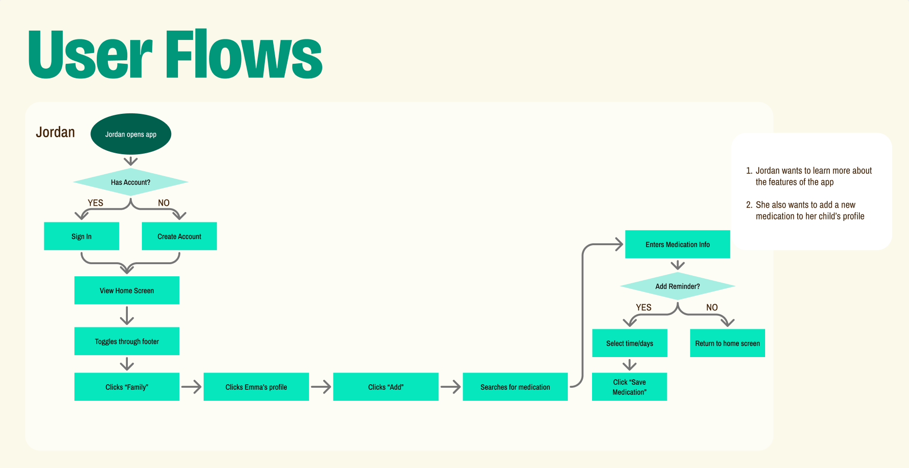
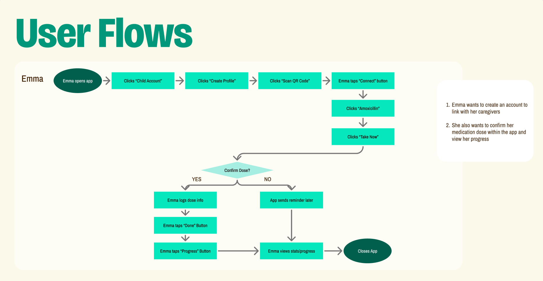
Mapping out the user flows helped me understand exactly how someone moves through the medication‑management tasks, from checking their schedule to confirming a dose. Breaking each step down showed where people might hesitate, get confused, or need extra reassurance. This process prompted me to simplify the paths between screens, reduce unnecessary taps, and make key actions feel clear and predictable.
Paper Prototypes
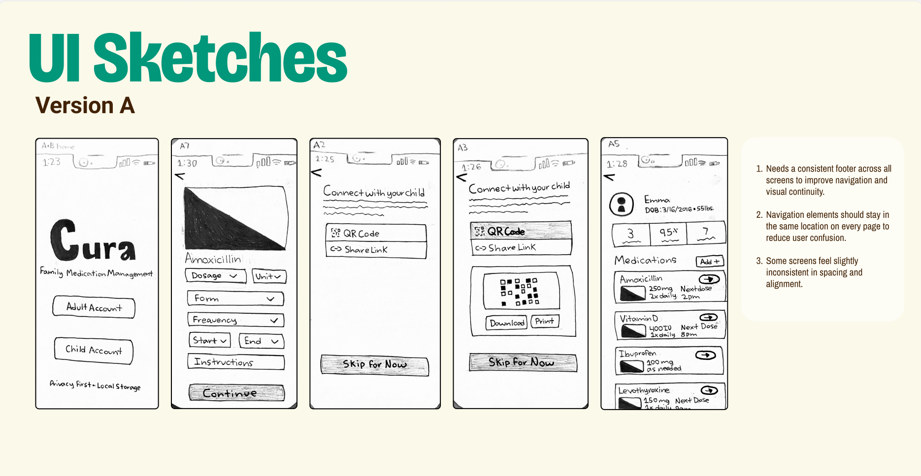
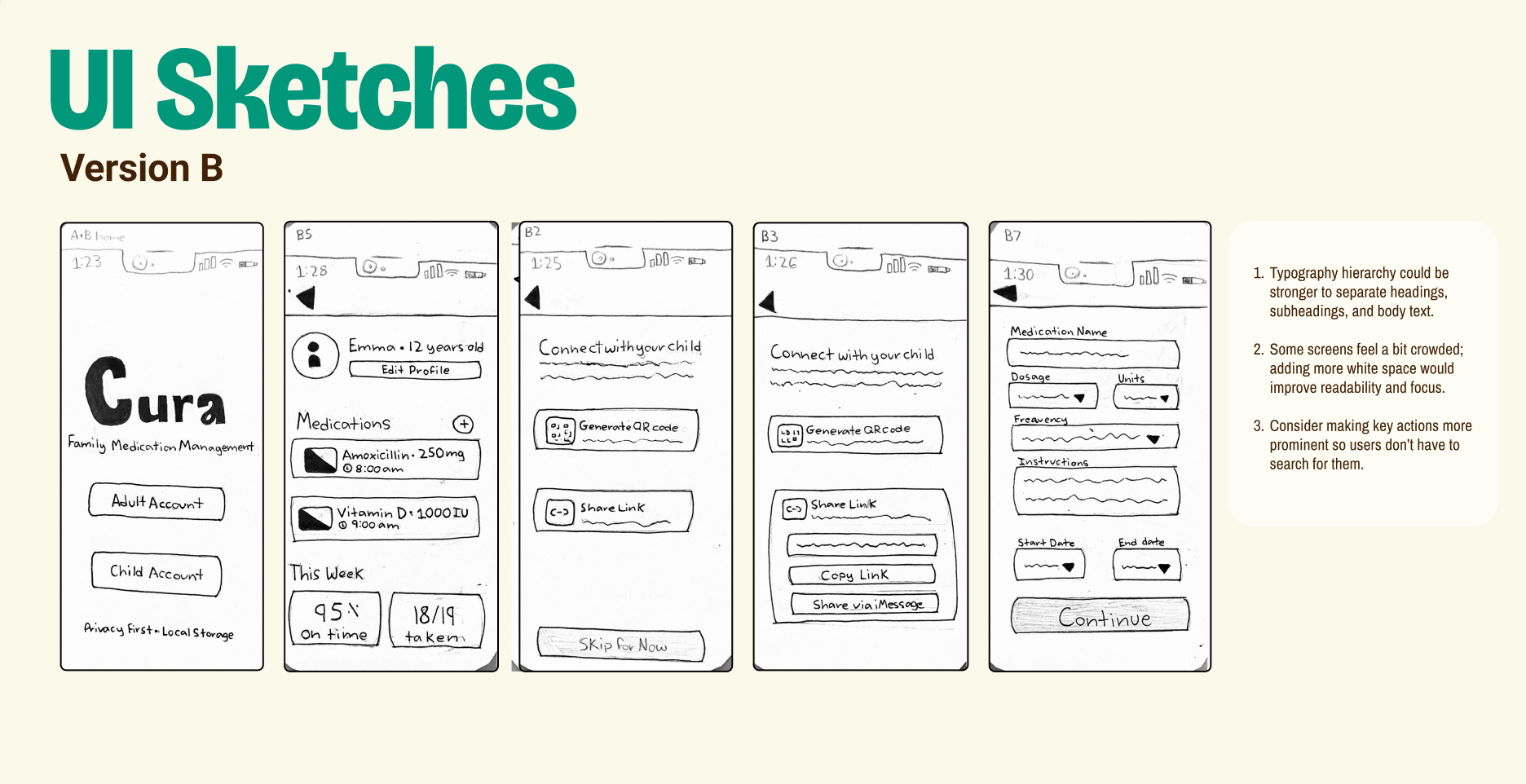
Creating paper prototypes allowed me to quickly test different layout ideas and interaction patterns before committing to higher‑fidelity designs. Sketching out screens by hand made it easy to spot confusing steps, tighten the flow between actions, and experiment with how information should be grouped on each page.
Digital Wireframes
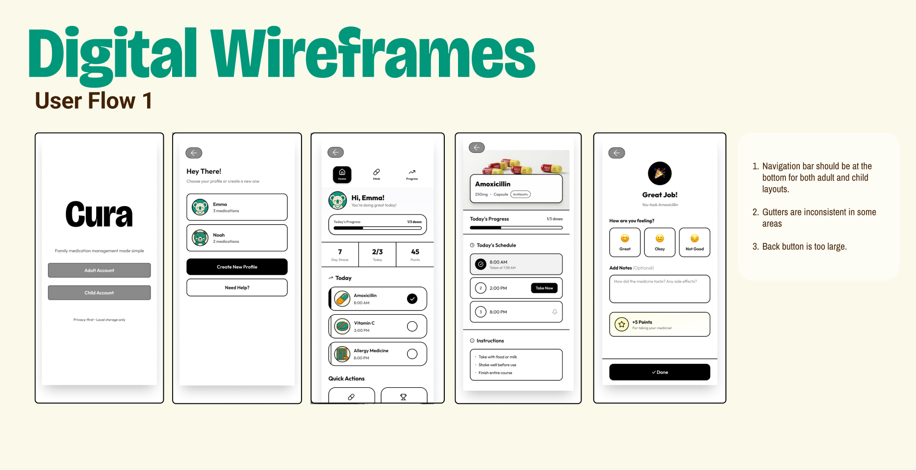
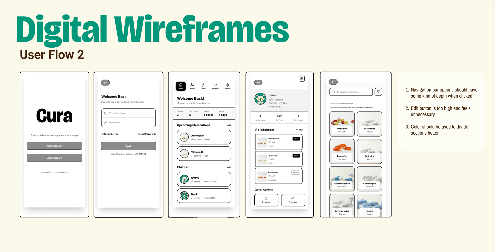
Creating digital wireframes helped me translate my rough sketches into a more structured, testable version of the interface. Working at this mid‑fidelity level made it easier to refine spacing, hierarchy, and interactions without getting distracted by final visuals.
Design System
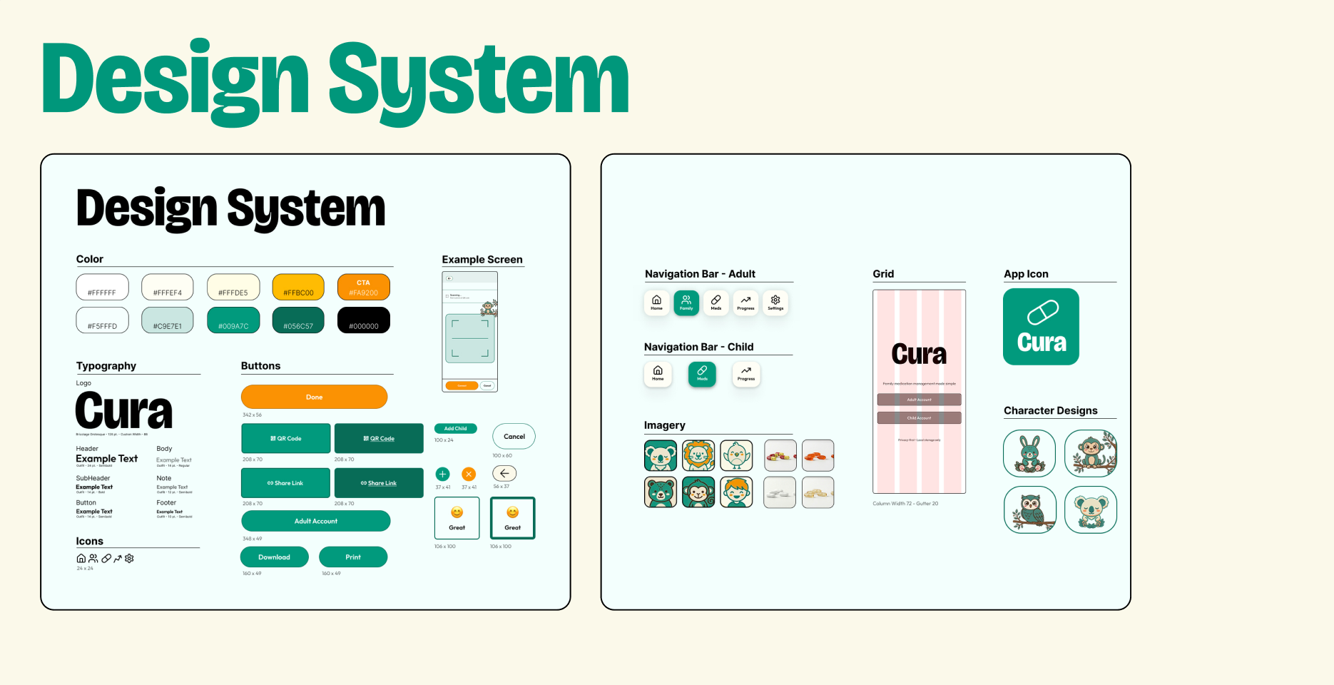
Building a design system helped me keep everything consistent as the project moved from sketches to wireframes to final screens. Defining core pieces like typography hierarchy, spacing rules, and component patterns made it easier to maintain clarity across screens.
Final Designs
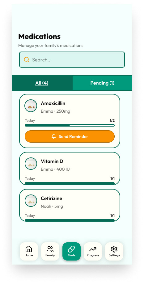
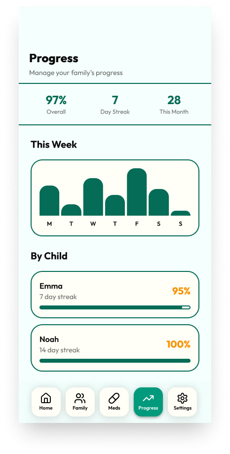
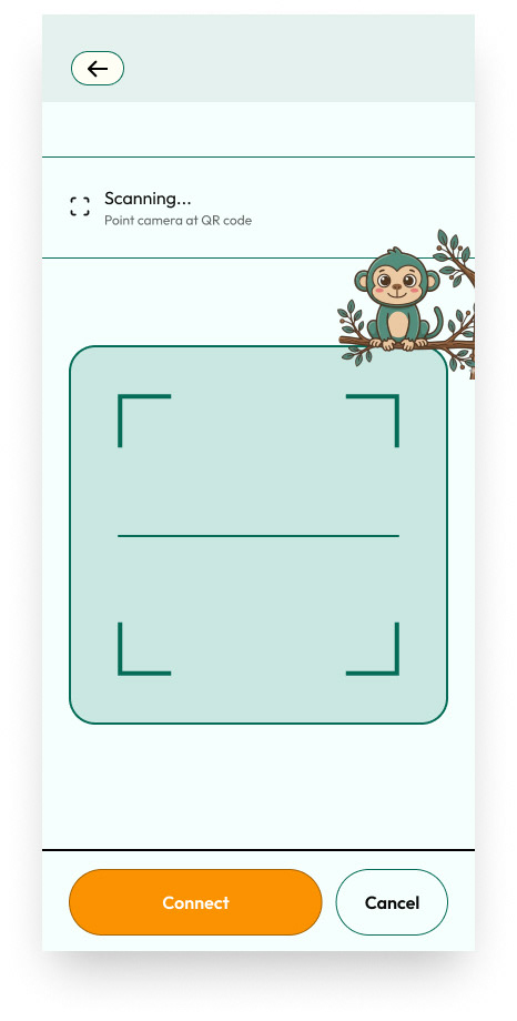
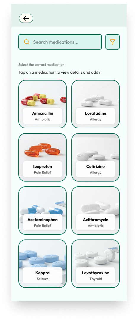
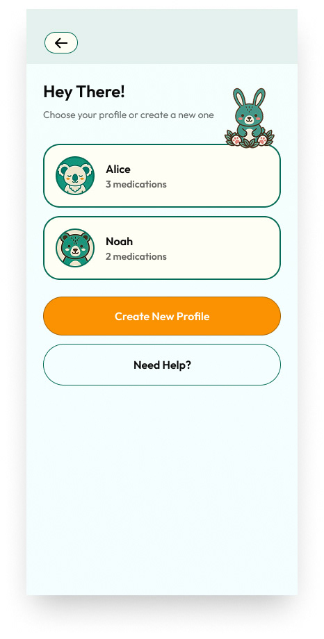
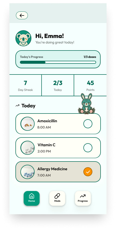
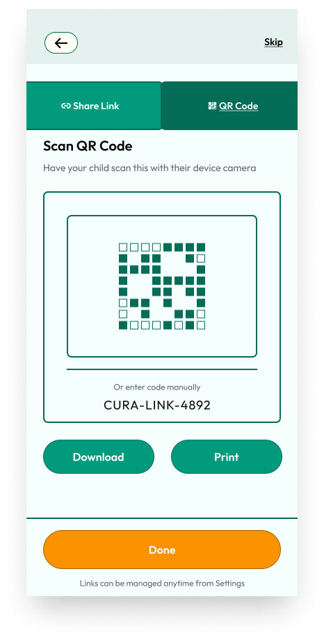
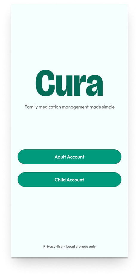
The final designs brought all the earlier work together into a clean, organized interface that supports both managing medications and assisting someone else with their routine. By refining the hierarchy, tightening the layout of the medication cards, and polishing key actions like confirming a dose, the final screens feel calmer, more intuitive, and easier to navigate. The visual system, spacing, and component patterns from the design system helped everything stay consistent, and the flows tested in wireframes translated smoothly into a clear, reliable experience.
Final Prototype
Click the icon in the top right corner to make the prototype full screen.